Leading product design for an AI healthcare platform
- Client
- US healthcare navigation platform
- Role
- Product Design Lead
- Year
- 2026
I lead product design and research for an AI healthcare navigation platform. It helps 3M+ users, who get it through their employer's health benefits, understand their benefits, find care and sort out claims. With the team, I design the assistant at its centre, which runs on 14 AI agents. I set the foundations the team builds on: how the product's information is organised, how conversations work, the structure across five parts of the user experience, and the design system.
- 3M+Users
- 14AI agents behind the assistant
Designing how the AI works before designing screens
The request that reached design sounded simple: add an assistant. There was no product spec. Before anyone drew a screen, I defined how the AI should behave for users, so every team would design against the same rules:
- One shared map of what users deal with, such as claims, costs, providers and documents, used by the assistant, search and the interface alike.
- How search works when AI agents find the answer, instead of users filtering lists themselves.
- Where AI shows up on the homepage and inside other pages, and how much of it.
- How the assistant shows where an answer comes from, and when it hands over to a person.
- The tone of voice, on the web and in the mobile app.
Behind the interface, the assistant runs on 14 AI agents. Together with engineering, I defined how conversations are structured, which information they work with, and how the parts of the user experience connect. I set up the design system and its first components. The team has since grown it, and every new screen is designed inside it.
One set of rules for AI everywhere
AI is not a separate layer added on top of the product. It follows the same rules in all five parts of the user experience. Proactive hints come in four agreed types, and help appears as a pattern inside the existing design system, not as a separate AI kit. The principle I set for the team: guide people instead of trying to impress them. Users need to know what happens next, and when a person takes over.
The expanded assistant: a concept ahead of the roadmap
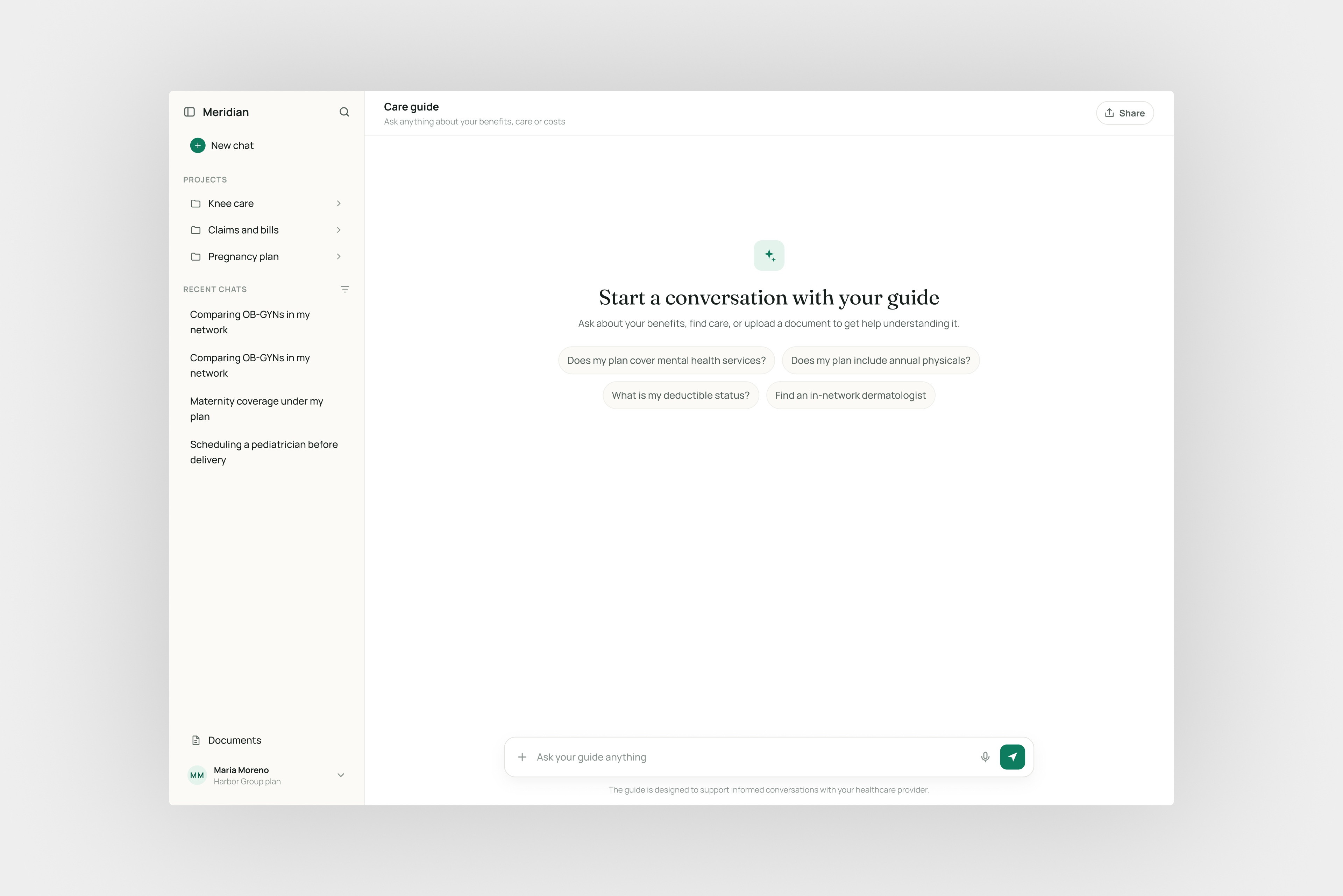
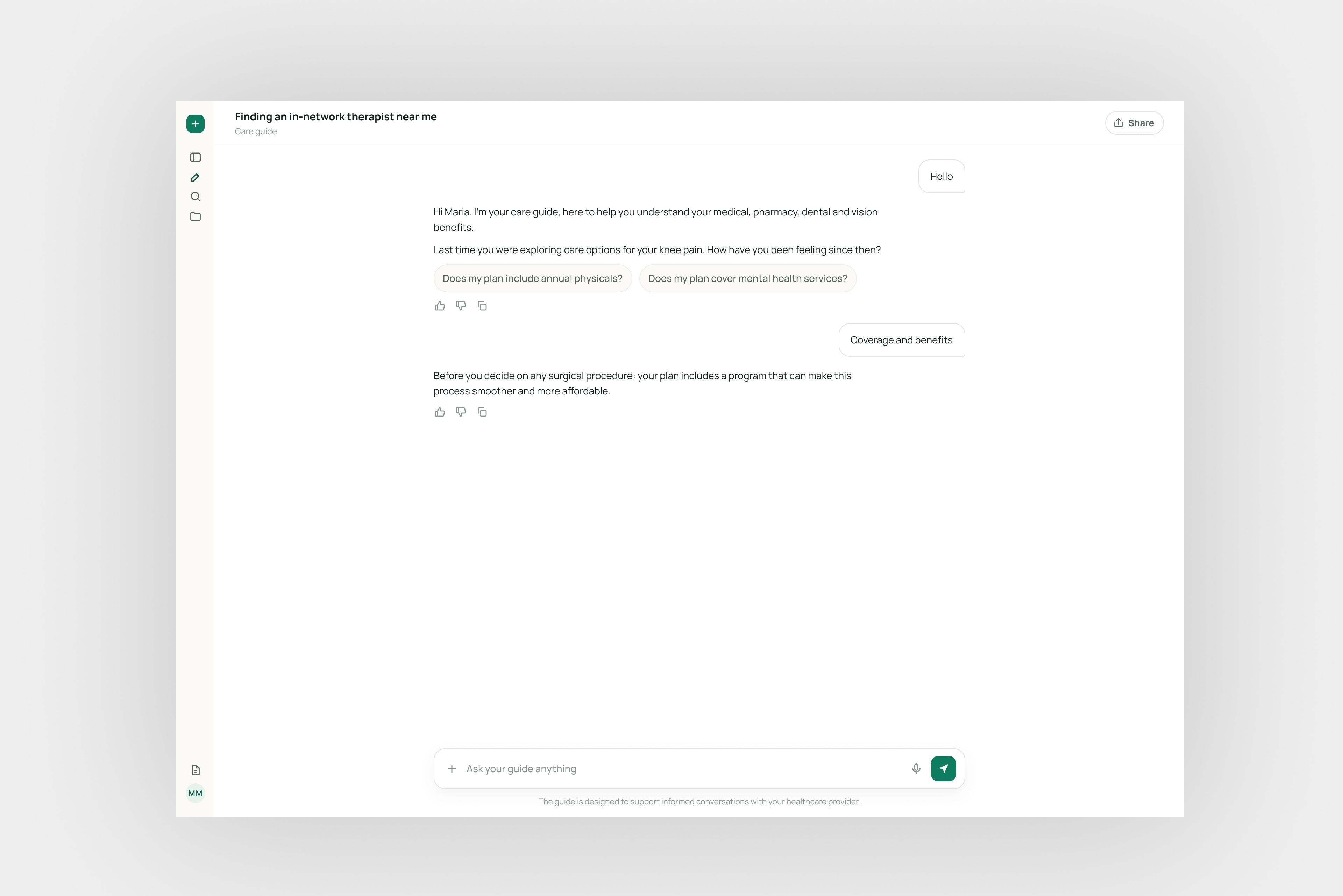
The assistant launched as a side panel for quick questions. Users kept using it for longer tasks: comparing providers, understanding a claim, coming back the next day with a document. I designed a full-screen version for that kind of work and documented the decisions so the team can build it. It has not been built yet. The screens on this page are that concept, rebuilt in a neutral design system so it can be shown.
Three user needs shaped it: room for longer conversations, conversations that are kept so nothing has to be repeated, and the option to bring in a document and have it explained. Each need pointed to something the product had to store: the conversation, the message and the document. I defined those three and how they relate before drawing any screen.
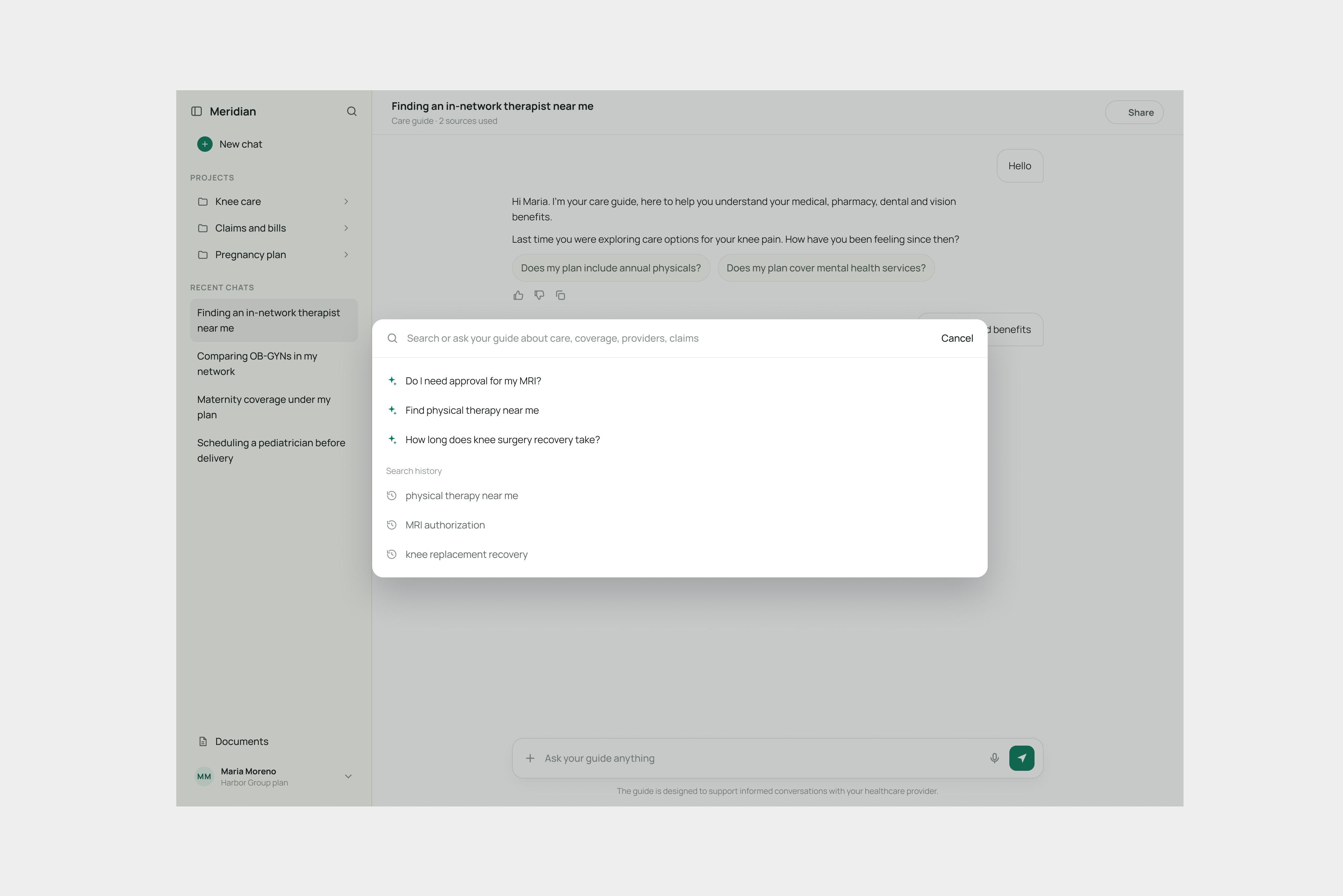
Conversations are saved, not one endless thread
- What I chose
- I compared three options: a fresh chat every time, one never-ending chat, or separate saved conversations with a history. One example settled it. A user asks about a claim, the assistant asks for a document, and the user leaves to find it. They come back the next day. Without saved conversations, everything is gone and they start over.
- What it cost
- A conversation list, search, and rules for active and archived chats, none of which the first version had.
- What it changed
- Topics stay separate, users can come back to finish something, and the assistant feels like it remembers. After team feedback we renamed the list to “chat history” and reworked where it sits when the panel is collapsed.
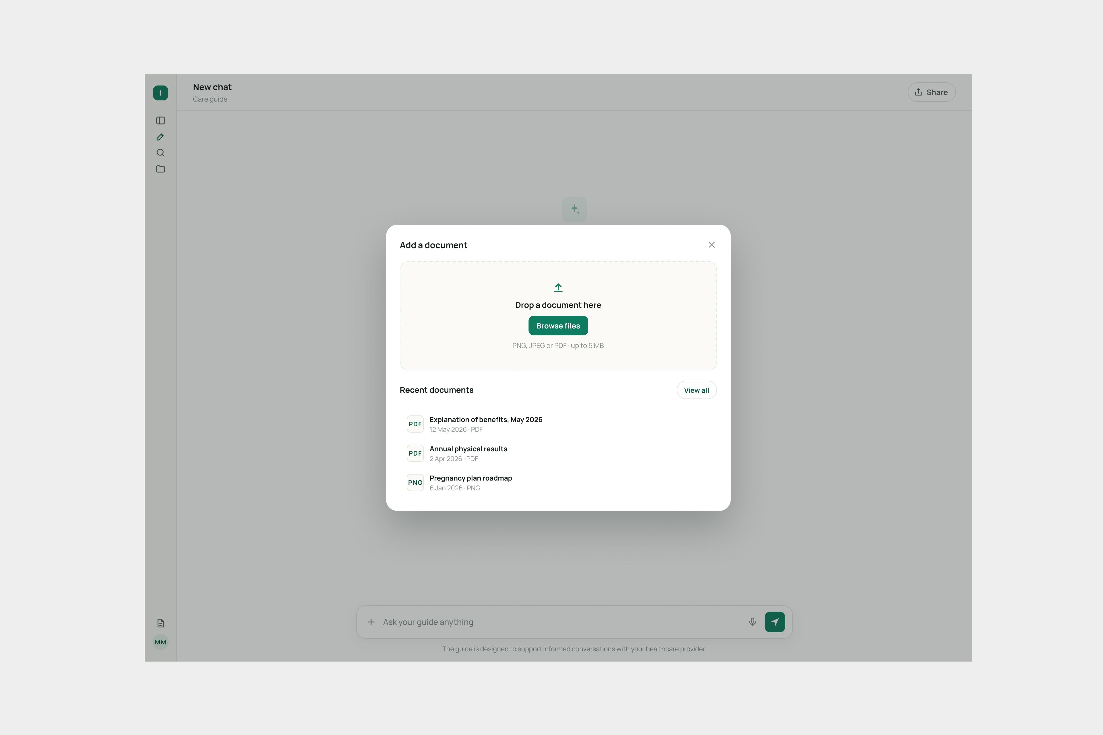
A document is uploaded once and reused across chats
- What I chose
- There were two options: keep each uploaded document inside the message it arrived with, or store documents once and let chats point to them. With millions of users, a copy in every chat multiplies storage and repeats the same processing, such as scanning, indexing and summarising. It also does not match how users think. The document is what matters to them, and the chat is the conversation around it.
- What it cost
- Clear rules for how chats and documents link, and what happens when either one is deleted.
- What it changed
- Users upload once and use the document in any conversation. Deleting a chat removes only its messages. “Review this document” anywhere in the app opens a new conversation with the document attached.
Answers show real product cards, not walls of text
Answers are built from the same components as the rest of the product. I documented them as a chat kit for the team: messages, a button that opens the sources, short status notes such as “looked into your claims”, cards for claims, costs and prescriptions with a colour-coded status, cards for numbers, links to the page where the user can act, suggested follow-up questions, and feedback buttons.
A claim in the chat is the same card as on the claims page
- What I chose
- Instead of building separate chat widgets, answers use the product's existing claim, cost and prescription cards, with their status and usual actions. A denied claim looks the same in the chat as it does on the claims page.
- What it cost
- Stricter rules for the AI: every answer has to name the item and the action, and sources are passed separately from the text.
- What it changed
- Users recognise what they see, can act without leaving the chat, and can check every answer against its source.
A person is one step away, and nothing has to be repeated
- What I chose
- When the assistant cannot solve something, it offers a health advisor. Before connecting, it shows a summary of what will be shared and why. The header and the input field change, so it is clear a person is now answering, and a note marks when the assistant pauses and when it comes back.
- What it cost
- A real handover process with the support team, and rules for what information may be shared.
- What it changed
- Users do not have to tell their story twice, and it is always clear who is answering. The assistant and the advisor share one conversation, in order.
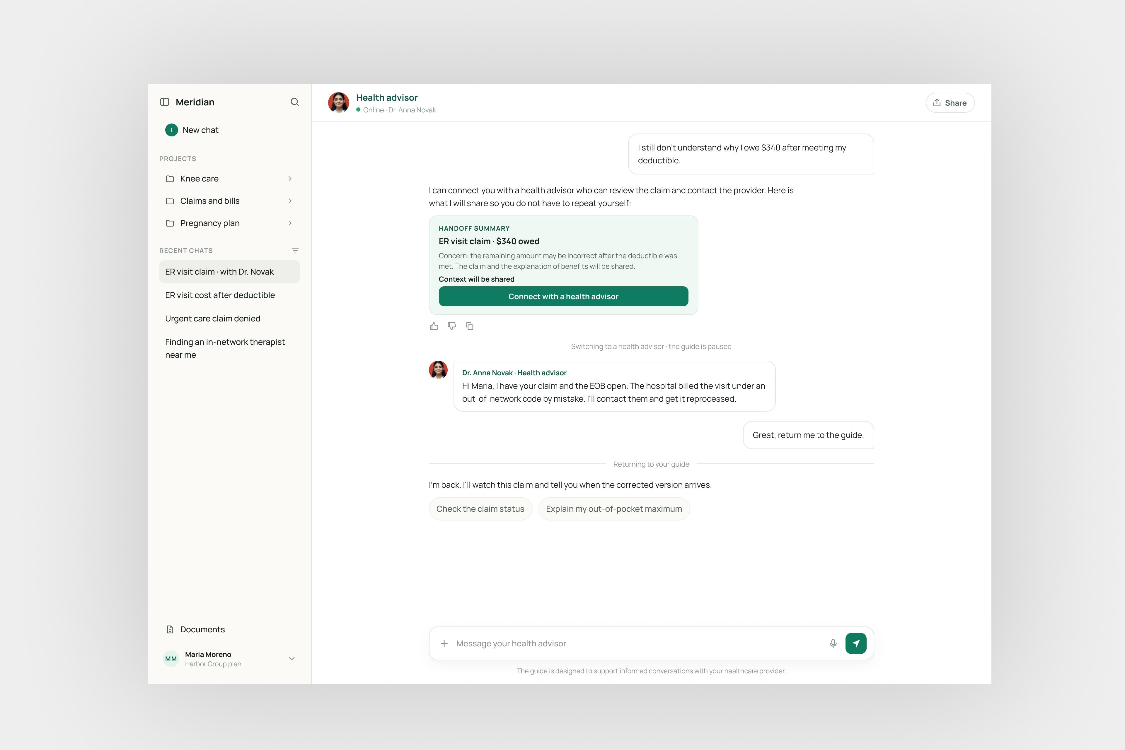
The screens are a neutral re-creation of the concept. The brand, names and data are replaced so the client stays private.
Leading the team
I lead the product design and research team across connected product areas. About half my time is hands-on design. The other half is leading: setting direction, reviewing work, running critiques and mentoring. Research owns how studies are run, and I shape the questions with them so the findings change decisions.
Early on, I proposed something unusual: designing from the product's information together with the backend developers, so the navigation and the backend model came from one shared map. Design leadership first saw this as outside design's job. I kept doing it. Product managers adopted it because, for the first time, they could see how a screen connected to the backend. Design leadership came round, and it was part of why I moved from senior freelance designer to the lead role within three months.
Accessibility as part of the work
We design to WCAG AA, the common accessibility standard. I worked closely with an accessibility expert, and components went through separate reviews with an external accessibility team.
More work
2026
A product design harness of skills that write down how I structure, review and document products.
2024
First product designer on a feature-led event platform. Built the design system from tokens to documentation; core event setup went from 60+ minutes to 9.
2025
A brand-refresh brief for a two-sided marketplace became a full product redesign built on seven core objects.