Agentic Documentation System
Agentic Documentation System is the design system behind my boards, object models, client documents and this website. One source of tokens in Figma drives all of them, and the same checks run on the work whether a person or an AI agent built it.
25 components · 60 tokens in light and dark · 26 text styles · updated 2026-10-16
Principles
- Structure first
Objects, relationships and content priority come before screens. Stickers, boards and documents follow object-oriented UX.
- Agents are first-class users
Every part explains itself, and a machine-readable manifest, commands and checks let an AI agent build without guessing. I review every change.
- One system, everywhere
The same tokens drive Figma boards, A4 client documents and this website. Colours change once in Figma and reach the site through an export.
- Accessible by default
Text is 4.5:1 or more on every surface, nothing on the site is smaller than 18 px, and meaning is never shown by colour alone.
Colour
Functional names that say what a colour is for. The swatches below use the live tokens, so they follow the site's theme.
Text
- fg/default#15161a · #e6e7eaMain text and icons.
- fg/muted#55575e · #a0a3abSecondary text: subtitles, notes, meta (7:1 on white).
- fg/subtle#686b73 · #878a92Quiet text: labels, dates (5.3:1 on white).
- fg/on-emphasis#ffffff · #ffffffText on accent or dark fills.
Surfaces
- bg/ground#f3f4f6 · #141518Page and board background.
- bg/card#ffffff · #1b1c20Cards and surfaces.
- bg/subtle#e9eaee · #24252bTags, hover fills, quiet panels.
- bg/band#eceef1 · #191a1eQuiet full-width bands on the website.
- bg/inverse#0f1013 · #0b0b0dDark blocks (clients, closing contact).
Accent and lines
- accent/emphasis#2b59ff · #5c7bffThe one accent: links, what changed, what is proposed.
- accent/subtle#2b59ff14 · #4a6eff29Faint accent wash behind highlighted content.
- border/default#15161a1a · #ffffff1aCard outlines and dividers.
Meaning (OOUX and tones)
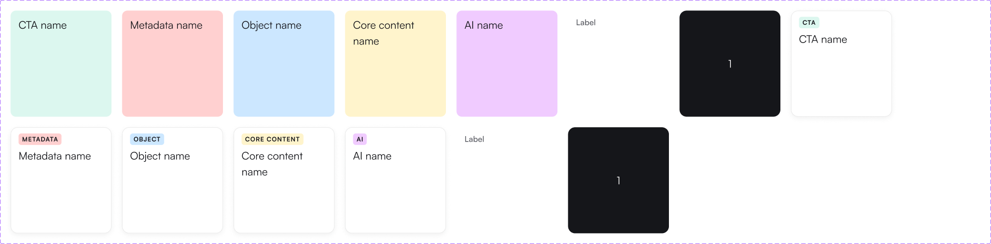
- accent/muted#cce7ff · #00294cSoft blue. OOUX: Object stickers. Comparisons: Next / proposed. Also neutral notes.
- attention/muted#fff4cc · #4c3c00Soft yellow. OOUX: Core content stickers. Information highlights.
- danger/muted#ffd0d0 · #480000Soft red. OOUX: Metadata stickers. Cons, risks, errors.
- success/muted#dcf7ef · #0d382bSoft green. OOUX: CTA stickers. Comparisons: Now / approved. Pros, positive outcomes.
- ai/muted#f0cbff · #33124aSoft purple. AI suggestions and AI-generated content.
- neutral/muted#f2f2f2 · #1f1f1fSoft grey. Table headers, neutral cells, Before / past states.
Type
Sora for headings and numbers, Satoshi for everything else. Nothing on this site is smaller than 18 px.
Sora SemiBold · 36 px
Page titleWebsite page titles.
Sora SemiBold · 28 px
Card titleWork row and card titles.
Sora SemiBold · 28 px
Section headingHome section headings: Work, Writing.
Sora SemiBold · 18 px
LogoName in the header.
Satoshi Regular · 28 px
IntroHome intro paragraph.
Satoshi Medium · 22 px
List titleWriting list titles..
Satoshi Regular · 18 px
BodyBody, lead, nav, links.
Satoshi Regular · 18 px
MetaYears, dates, captions, usually fg/subtle, tabular numbers..
Satoshi Bold · 18 px
EyebrowSmall-caps label tier..
Components
Two families: parts for boards and documents in Figma, and the parts this website is built from, each mapped to its React component.
Boards and documents
- Stickers
OOUX sticker. Style=Tint (default): soft colour fill, no label, for dense boards such as object matrices where colour carries the meaning. Style=Card: white card with a small type label, for stickers that stand alone or in a legend. Type: Object blue, Core content yellow, Metadata red, CTA green, AI purple, Label (quiet text), Row number (dark marker). Text: Name. Never recolour a sticker by hand: pick the Type. Do: Use Style=Tint in dense boards such as object matrices: colour carries the meaning. Don’t: Do not put type labels on every cell of a dense board.
- Board / Header
Top of every board: eyebrow (project · section), number, title (Heading) and one sentence of context. Do: Start every board with one header: eyebrow (project · section), number, title, one sentence of context. Don’t: Do not stack two headers on one board; split the board instead.
- Comparison / Version
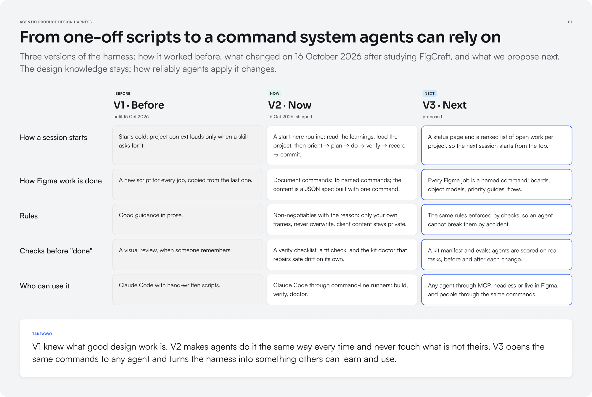
Column header: a tone label (Before grey, Now green, Next blue), title and subtitle. Do: One Version per column; tone Before (grey), Now (green), Next (blue). Don’t: Do not compare more than four columns on one board.
- Comparison / Cell
One answer in a comparison grid, same Tone as its column. Before = muted grey, Now = white card, Next = white card with the accent outline (proposed). Do: Answer the row's question in one or two plain sentences. Don’t: Do not mix tones within a column.
- Comparison / Takeaway
One-sentence conclusion at the bottom of a board. Do: Close the board with one sentence that says what the comparison means. Don’t: Do not repeat the rows; say the conclusion.
- Block
Document building block. Block = variant; edit text through its text properties (Text, List items, Step title, …). Tables: pick table - N col, then set the exposed rows' Column 1–N. Do: Build documents from blocks and edit text through their properties. Don’t: Do not detach a block to change its text.
- Table / Data row
Data row with up to six columns; text properties Column 1–6. Use inside a Block table variant (2–6 col) or stack rows in an auto-layout frame. Do: Colour a cell only when it carries OOUX meaning (object, core content, metadata, CTA). Don’t: Do not use colour as decoration in tables.
- Project Cover
Cover for a project, test project or hiring assignment document. Do: Open hiring assignments, test projects and case files with a cover and status. Don’t: Do not use the cover inside boards.
- Web / Card
Website diagram card (736 px column scale). Type carries the meaning: Object (object models), Step / Start / View / System / AI/Decision / Done / Error (flows). Highlight = the key item. Set width per diagram; height hugs. Never detach; never hand-paint.
Website
- Nav
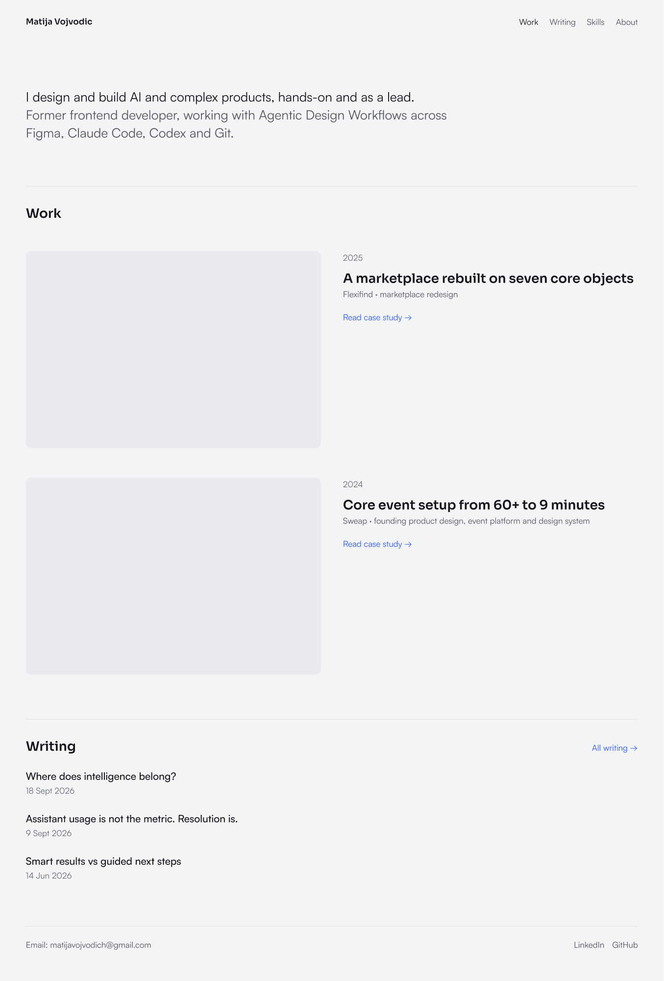
Header: name left, links right (Work, Writing, Skills, About). Active link fg/default, others fg/muted.
- Intro
Home intro: one paragraph, first sentence in fg/default, the rest fg/muted, max 58rem (928 px).
- Section header
Section start: hairline above, heading left, optional link right ("All writing →").
- Work row
Selected work: image left (3:2, radius 12, bg/subtle behind), text right: year, title, one line, accent link. Two equal columns, gap 48.
- Writing row
Writing list item: title (22 px medium, hover accent) and date (fg/subtle).
- Chip
Tag: pill on bg/subtle, 18 px fg/muted.
- Stat
Outcome number: value (Sora 28), what it means (fg/muted), source (fg/subtle).
- Decision
Case-study decision: title, then labelled paragraphs (What I chose, What it cost, What it changed). Column 45rem.
- Footer
Footer: hairline, email left (selectable), LinkedIn and GitHub right, 18 px fg/muted.
How agents use it
1
Parts that explain themselvesEvery component, token and style has a description and a scope, so the right choice is written down, not guessed.
2
A manifestA generated file lists every component, property, token and style. Agents read it instead of inspecting the design file.
3
CommandsDocuments are built from a content spec by named commands; the same commands are used by people and agents.
4
A doctor that repairs driftChecks for raw colours, missing styles, low contrast and misused stickers, in Figma and in this site's code. Safe fixes are applied automatically; the rest is reported.
5
One source of tokensFigma variables are exported to the website's CSS, in light and dark.
Changelog
October 2026
Agentic Documentation SystemRenamed and rebuilt: the website's visual language, functional token names in light and dark, website components, the manifest, the doctor and the token export. 75 hand-recoloured stickers were switched to their real type.
2024
Documentation KitStarted while learning object-oriented UX: stickers, blocks and tables for research and documentation boards.